

Here’s What You Need to Know about Choosing Interior Paint Colors
The paint colors you choose for your interior walls form the basis for the rest of your home’s interior design scheme, and they need to be colors you can live with – you don’t want to end up returning several cans of unused paint, or even faced with repainting one or more rooms.
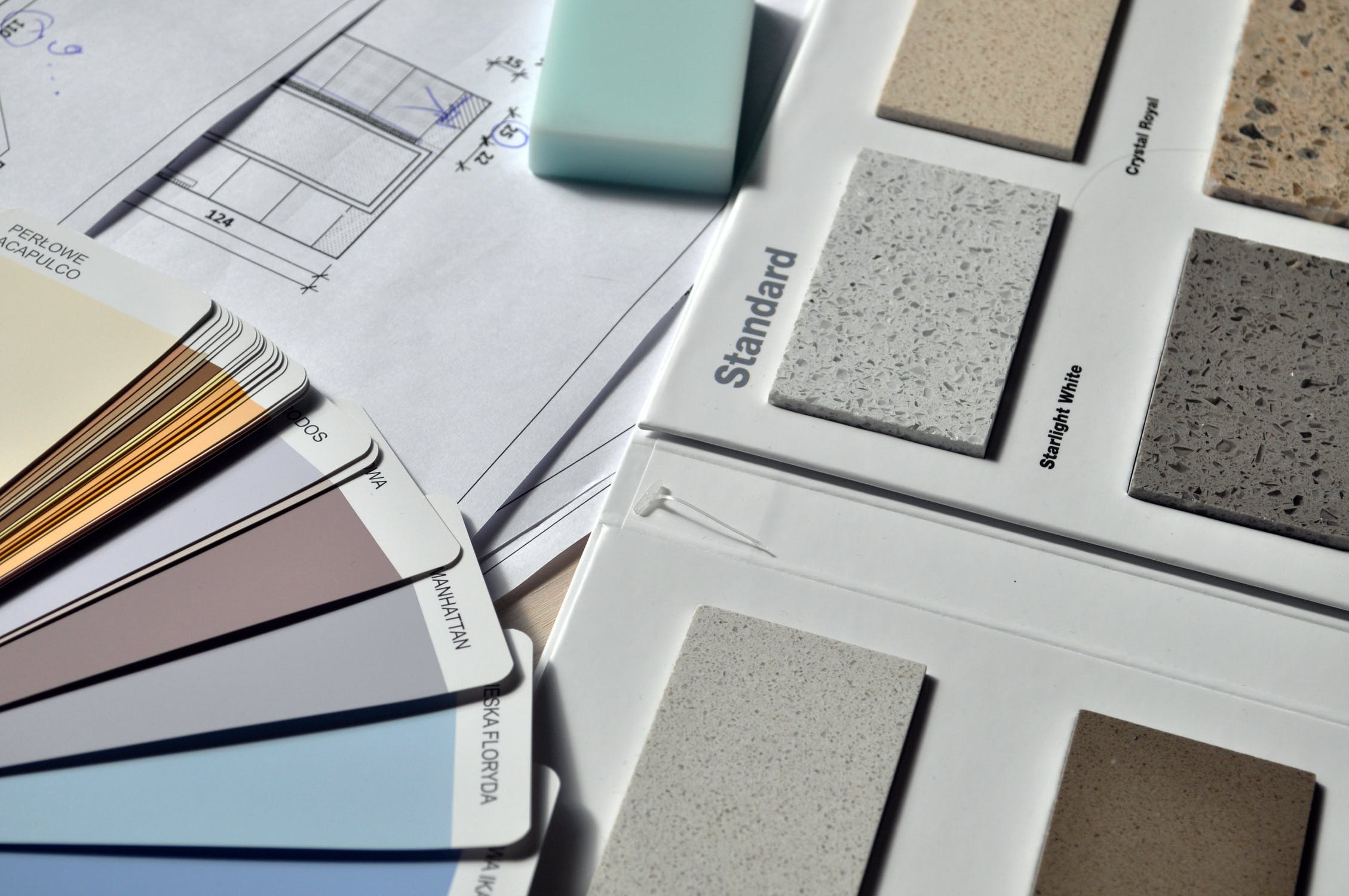
But you don’t need to be an art school graduate in order to choose the right paint colors. Nor must you feel constrained to neutral beiges, whites, and grays. Choose colors that you already know you like, and use a color wheel to choose complementary hues. Look to your upholstery, rugs, furniture, and artwork for color inspiration; consider your home’s architectural features, and how to highlight them, when choosing a color scheme. Also bare in mind that certain colours might affect sleep.
Use Your Personal Tastes as a Guide
Could choosing paint colors for your home be as simple as choosing colors you like? Yes! But, of course, you don’t want to end up choosing a color with the wrong undertones or a color that won’t suit the space you’re using. We know a homeowner who painted her bathroom walls mint green – only to discover that it made her look corpselike in the bathroom mirror. Don’t let that be you.
Remember that while there are thousands of shades, there are really only seven colors: red, orange, yellow, green, blue, indigio, and violet. Any shade you choose is going to come from one of these seven categories, so go ahead and eliminate least favorite one or two before you do anything else.
Next, look for colors you love in your current décor – your upholstery, throw cushions, rugs, artwork, lamps, or other decorative items might contain colors that would look great on your walls. You could choose a color that matches a hue in your upholstery’s pattern, for example, to tie the room together; for a more subtle look, choose a slightly darker or lighter shade.
Want to use multiple colors in the same room? You’re allowed! Use a color wheel to find complementary shades. You can create a more unified look in your home by choosing complementary shades for different rooms, too. Lighter shades can make a room look bigger, while darker shades can make it cozier. A light shade on a ceiling gives the room an airy feel, while a darker ceiling color can give the room a more intimate ambiance.
Highlight Your Home’s Architectural Features
Traditionally, architectural features like molding, mantels, built-ins, wainscoting, doors, and door and window frames have been painted white, and doing so can create crisp lines that make colored walls pop while delineating one bright and colorful space from the next, equally bright but differently colored space. White wainscoting can be a great complement to a deep, rich color, and white goes with everything.
Of course, you can use a different, complementary paint color to highlight architectural features like molding and wainscoting, and show off your personal style. Choose a complementary color, or even a matching patterned wallpaper, for built-in bookcases and niches, or create the illusion of wainscoting by painting the bottom third of a wall a darker shade than the top two-thirds, and installing a chair rail painted to match the darker color.
Painting molding and other architectural features calls for a steady hand and nice, clean lines, so it might be worth searching for “interior painters near me” to find someone who can help you do a good job. You’ll be looking at these walls for a long time, so you want them painted right.
Get Creative with Neutral Tones
If you’re not a bright colors person, you can still get a stylish, unique look with neutral colors. Beiges, grays and whites are also the best look to set off strong accent pieces, like an Oriental rug, large paintings, or bold upholstery. Consider painting stripes or other patterns using neutral colors, for an interesting but restful look.
Play with Finishes
Most people choose a satin finish for walls and a high-gloss finish for trim, since satin finishes are more washable and more forgiving of imperfections in the surface being painted. But changing up the finishes in your room can create a unique visual effect in your room. Paint one wall in a satin finish and the one next to it in a semi-gloss, for a velvety reflection when the light hits it. Expand your rooms with a high-gloss finish on the ceiling – it will reflect more light, and make the room seem bigger.
Plenty of people are afraid to choose bright, bold paint colors – but with the help of a color wheel and a little courage, you, too, can live in a colorful interior. With thousands of shades to choose from, you’re limited only by your imagination. So get down to the paint store, and sample some paints today!